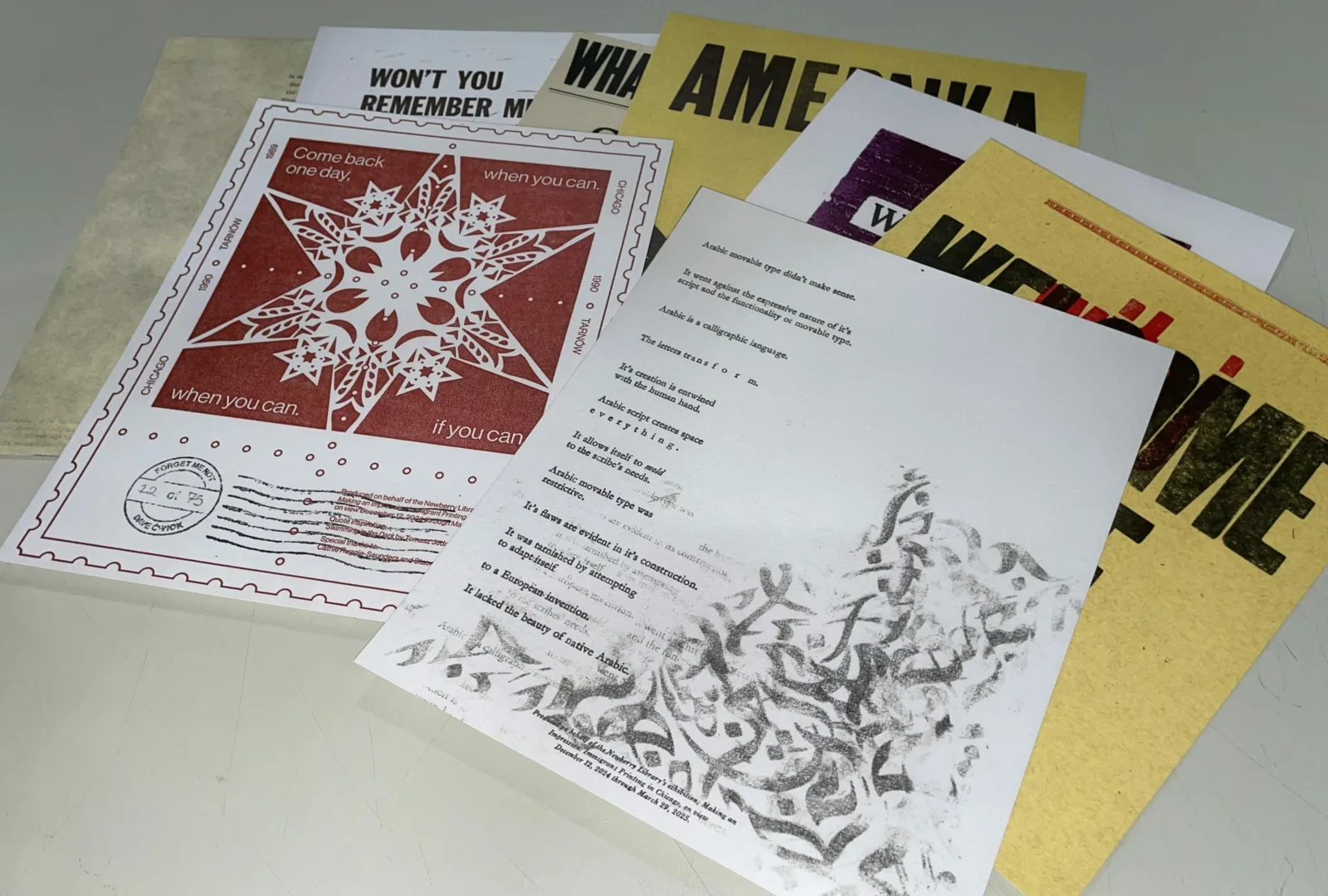
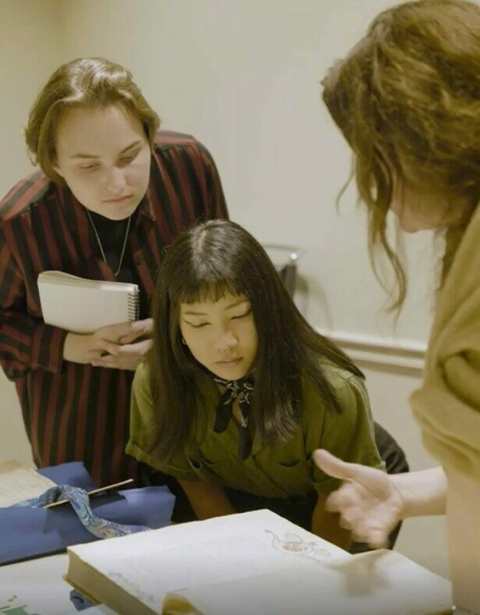
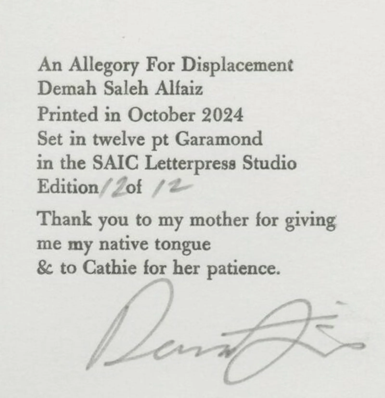
In September of 2024, eight current and former students at the School of the Art Institute of Chicago (SAIC) visited the Newberry to see and learn about the items on display in Making an Impression: Immigrant Printing in Chicago, curated by Jill Gage. In response, each student created their own broadside designs to share with exhibition visitors. We recently caught up with two of the contributors, Demah Alfaiz, who created “An Allegory for Displacement,” and Dave Ćwiok who created “Forget Me Not,” for a Q&A.
NL: What was your experience like seeing the exhibition items?
DA: It was a validating experience. The exhibition showcases some ephemeral items that you wouldn't think would be cared for, but seeing this material maintained and protected was assuring. These items also broadened the scope of how one can view the immigrant experience. Sometimes it's a limiting term, but Jill showcased a wide range of items that prove the immigrant experience is multifaceted.
DĆ: Seeing the items unlocked so many ideas and research possibilities for this project. Jill displayed a diverse array of Chicago immigrant stories, historical and contemporary, and it was a great reminder of the resources we have here in Chicago.
NL: Could you walk us through your creative process with your broadsides?
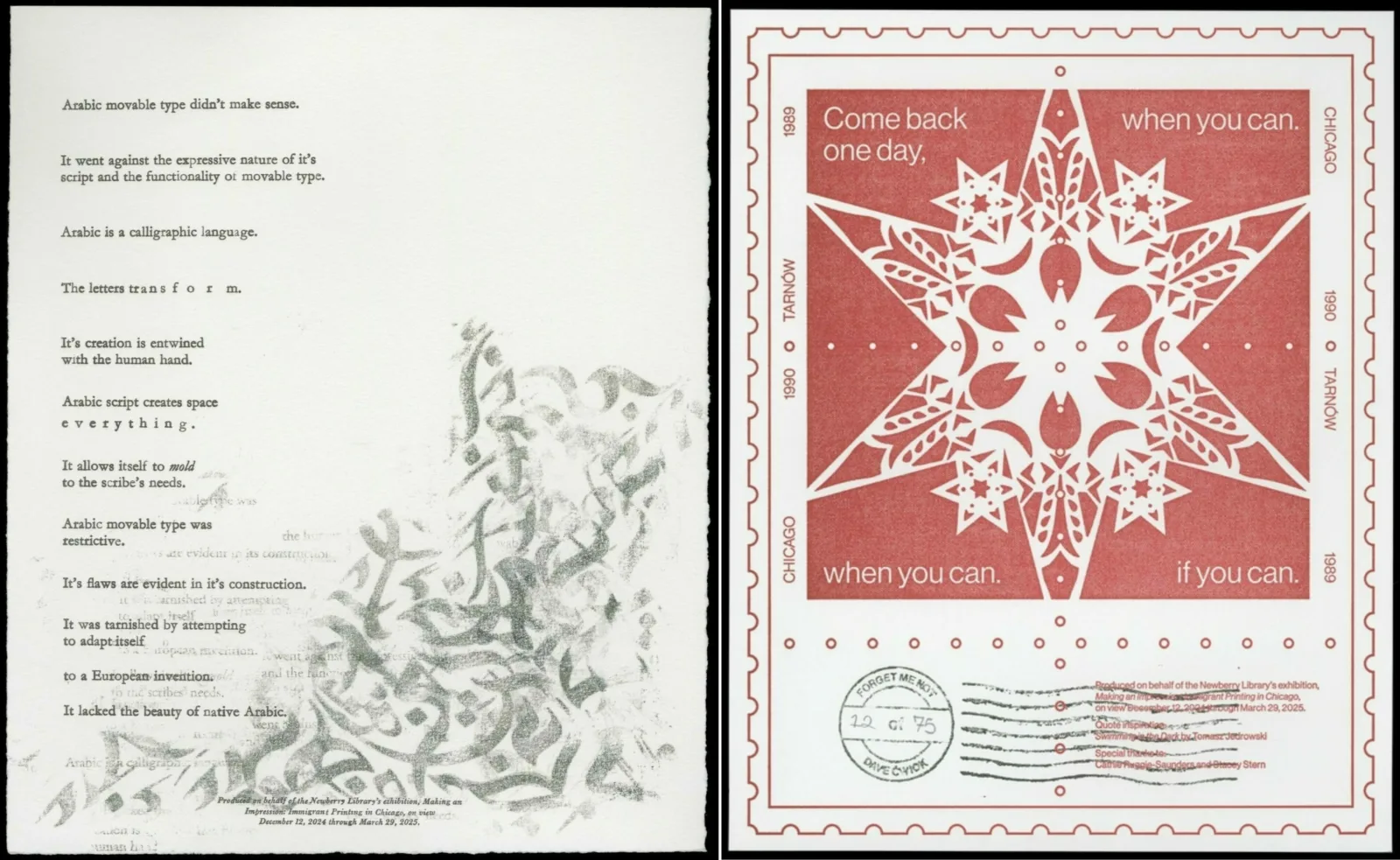
DA: I was still an SAIC student when working on this broadside. When learning about letterpress history in school, all the examples we examined were English or Latin, which made me think about what printing was like in different languages, specifically Arabic. My teacher, Cathie Ruggie Sanders, encouraged me to investigate Arabic print history, and I owe a lot to her for her guidance.
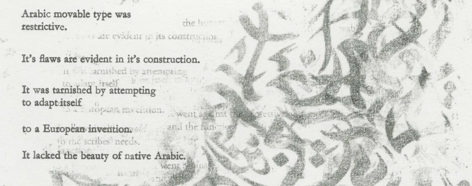
The English text on my broadside took about five or six drafts to get right. Initially, that text was in the form of an artist book, so each line had its own page. That transfers over to the final product since each line is sort of isolated and is allowed to hold its weight. I wanted the line-by-line English text to juxtapose the Arabic script that has a more layered and weathered appearance. I printed a bunch of copies of Arabic calligraphy and did a transfer method with layering that helped to achieve that look.
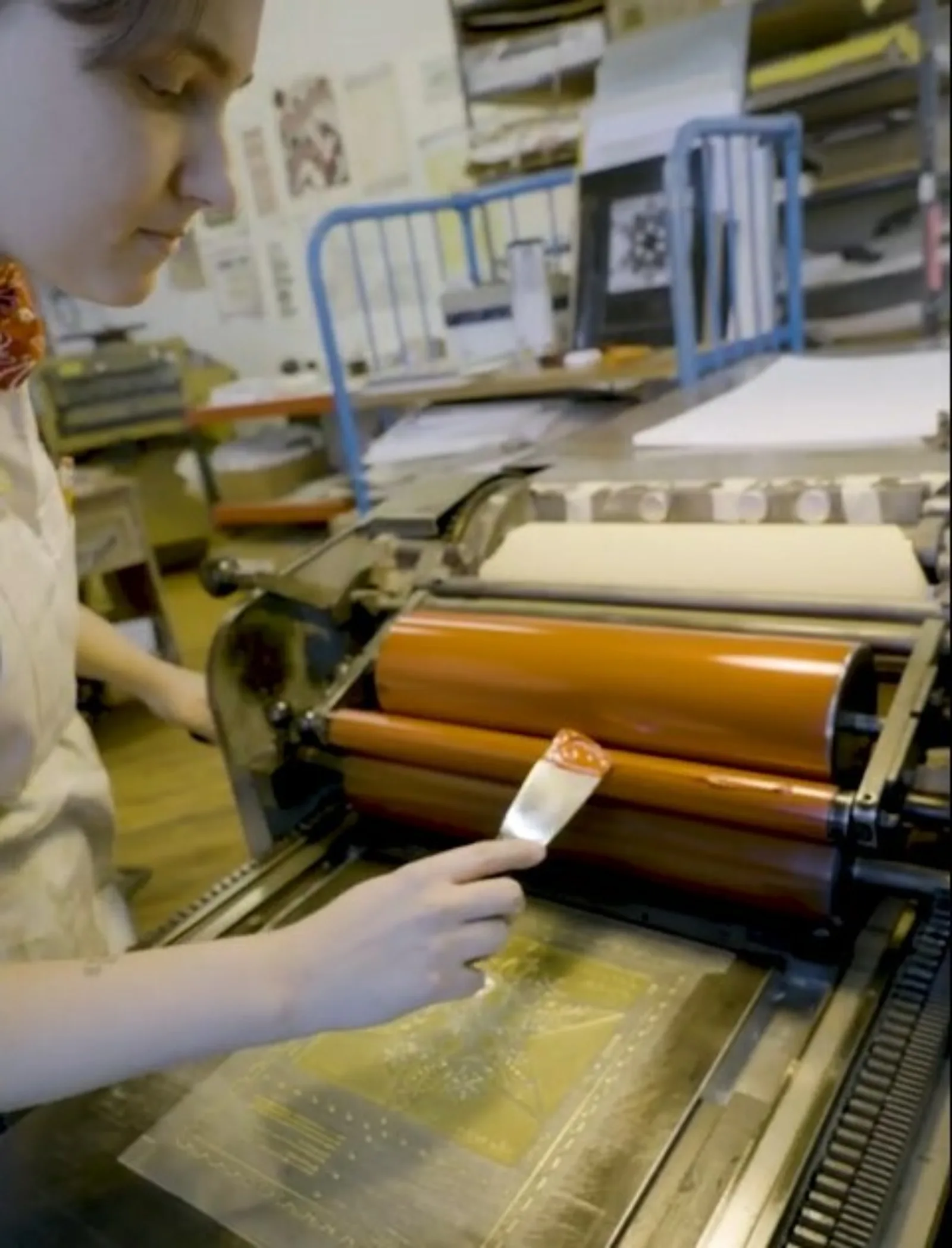
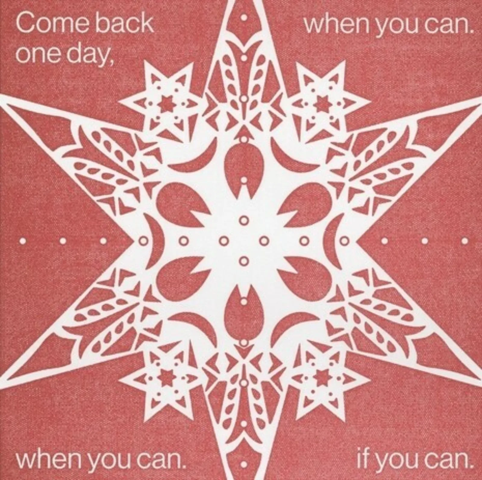
DĆ: I graduated from SAIC two to three years ago, and this was my first time doing a letterpress project since then. I started this project digitally since I didn’t have the resources of SAIC on hand, but I wanted to stay grounded with physical craft making. I began researching wycinanki, a traditional form of Polish folk art made from paper cut outs. Inspired by this method, I cut out pieces of paper and scanned them back into my digital format to make the shapes seen in the center of the star in the stamp block.
In the beginning, I was working on this project from my apartment, which forced to be more confident in reaching out to people in the letterpress community. I contacted established Chicago printers like Stacey Stern at Steracle Press, who was so helpful in the formation of this project. I also kept in touch to other SAIC printers who were in their last semester or just graduated allowed me to open up to others and be a resource for them as well. It was great to see these networks form as a result of this exhibition.
NL: Both of your broadsides are personal in nature but are also brimming with historical context. Could you unpack how you blend this history with your personal experience?
DA: As I noted in my artist statement, the forced attempt of applying Arabic to movable type didn’t make sense. Due to the (at least) three glyphs per character, accents, and a range of ligatures, Arabic script is based on artistry and open expression that would be restricted by movable type. There is a confusing and esoteric history with Arabic movable type that drew me in. I saw myself in it and wanted to inform viewers of this history while also blending aspects of my personal experience.
The overlap of this history and my experience is present in the awkwardness of trying to assimilate. My mom moved from Saudi Arabia when she was very young, and she struggled to assimilate into day-to-day life in a country that wasn’t adoptive. Having been born and raised here in the U.S., my experience has been one of trying to find myself in Arabic culture when I grew up distant from it all.
DĆ: Something I talk about in my artist statement is the historical experience my family lived through when Poland was under communist rule. At this time, most people had to get permission to leave, and leaving presented this uncertainty of never coming back. This push and pull centers what my family and many who moved from Poland to the U.S. experienced. The quote I have on the broadside, “Come back one day, if you can” or “when you can” is representative of this conflict.
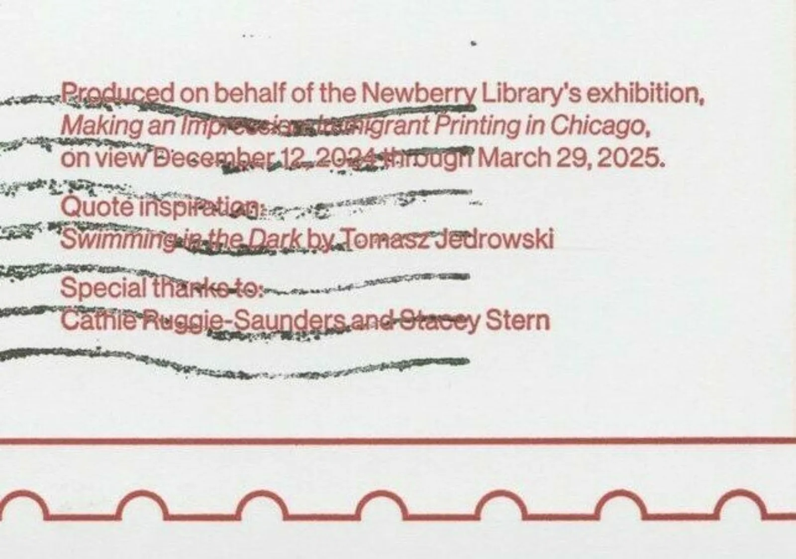
The quote is inspired by the novel Swimming in the Dark by Tomasz Jedrowski, which is about a queer love story in 1980s Poland. It allowed me to consider a period in which people were searching for freedom in a time that it was actively silenced, and that being tied to queer identity was so special for me. In a way, this quote is a way of me also inserting a bit of my queer identity into the artwork.
NL: Has this project impacted your creative process going forward?
DA: Definitely. I was studying graphic design, and my experience with this art form was not as research based as other art forms. Working on this broadside made me realize how important research was to me. I’m now more considerate as to why things are the way they are, and more concerned with the history behind the topics I choose to explore.
DĆ: This project was a good reminder that research is important, but I had to make sure that I didn’t get lost in the deep thinking over what I want. The research informs the form, but nothing will take shape until I get past the comfort zone of research.
NL: What does immigrant printing mean to you?
DA: Immigrant printing is about being persistent and sustaining your culture. I think print and analog methods are the most apt methods of representing the immigrant experience. It’s about preserving tradition despite the obstacles that may silence or cast aside the immigrant experience.
DĆ: One way I think about immigrant printing is intentionality. Being intentional about what to include. Immigrant printing is deliberate thinking and having the courage to act upon the decisions because of that thinking, both in art and in life.
Making an Impression: Immigrant Printing in Chicago is on view in the Newberry’s Hanson Gallery through March 29, 2025. Visit the exhibition to pick up a reproduction of one of the students' prints.
